 | ||
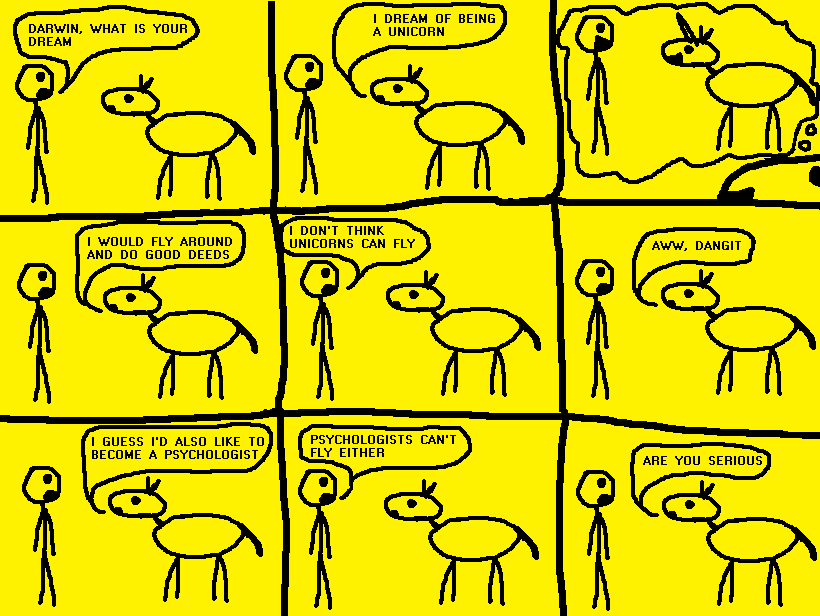
       DARWIN'S DREAM 
SHIRTS. I am going to go see about getting them printed pretty soon. Here is the design I'm looking at: http://www.supermegacomics.com/ShirtLogo.gif That design is for a black shirt, the black backround represents the black shirt. I'd be interested to know whether you guys would rather have the first shirt be yellow or black. In fact, I made a poll in the forum HERE. Signing up is fast (you don't need e-mail confirmation), and you don't need to plan on buying a shirt, I'd just like to get some general opinions. Once again, CLICK HERE TO VOTE FOR SHIRT COLORS TIME FOR FAN ART The first is by Kapsi and here it is. I like this one a lot, it seems like they did it the way I do many of my comics, which is by starting with an interesting question or phrase and working from there. The last two frames are perfect. God in the sky with the two smiling clouds is funny too. Next is Bad Tooth by Zealous Demon. It's funny how the cannibal has some weird dinosaur-man head. And in the last frame where they guy is standing out of his mouth all scared is great, if it had just shown half of the body dangling out of his mouth it would not have been as good. :^: means thumbs up, :^: Third is Long Arms by Oddballout. This one cracks me up for some reason. It seems like it shouldn't be that funny, but I think it's hilarious. The expression of the guy on the right in the last frame is hilarious. He has one of those expressions that's like "Ohhh yeaahh, that was good". The caption "Totally long arms. Totally." is good too. I don't know why I like this one so much Fourth is Up In The Sky by SnickerD. I like how the guy is crouching all funny in the middle frame. I also like how the speech bubble exists in all three frames, with the guy pointing at it, crouching under it, and dissapointed standing next to it. It's very deep Another comic from the High School Humor class that made Super Mega comics, this one is Journey by Garnet. I like the idea that the guys are just walking along, and saying they are on a journey. A Grand and Glorious journey, no less. I like how in the last frame the guy losing his head just seems surprised, and the guy on the right has the perfect expression- dissapointed and mad at the same time. Thanks Garnet! I said before that johnham suddenly submitted a ton of fan art, and he did, so here is another one by him called Enormous. I like Johnham's art style, he adds a lot of cool little detail. Also, a big guy crying because some guy called him enormous, when he obviously is enormous, that is funny. I also like the frame where the big guy says hello Last is a piece by Uriel, and if you haven't read the PLANET TO THE MOON SERIES (And why haven't you!?), you won't get it. Oh, and Here it is. It's exactly how I would have envisioned it. It's kinda gross though, if you think about it. Whoo yaaay -JohnnySmash Contact: JohnnySmash AT gmail DOT com
|
 |
|

